

Cover Art Processes


This was another quick warmup album cover. My aim was to learn how to add textures (as I had recently acquired some). It was also a chance for me to practice using tracking (for the text).
I was inspired by the existing album cover 'anniversary' and wanted to create an idea somewhat similar.
I made a silhouette of Bryson Tiller and added a background which I used the gradient tool (learnt from the previous album cover) and added plastic texture and the text.
This is an album cover where I mostly used the gradient tool.
I downloaded the man from 'pexels.com' and then added a gradient map over the image. I chose a monochromatic blue palette as I was going for a more minimalist aesthetic.
I then added text that I thought conveyed the idea.
This album cover was a warmup and took approx 15 minutes.
I found it was quite useful making this as it showed how to create a cartoonish effect, without using filters.
The tutorial I followed mainly focused on using blending modes and the brush tool, to create these effects. Whilst doing this tutorial I not only learnt about using blending modes, but also I learnt a technique that I could use with the brush tool, a way to rotate the brush after every stroke.


I made this cover as a test as I wanted to see how many techniques and methods I had retained.
I also wanted to learn to cut out Afro hair
I used a woman from ‘unsplashed’- a free site where one can get high quality photos and videos. I mostly played around with the adjustment layers, blending options and filters.
I like the almost posturized effect that the woman has on her which I achieved through the blending options. However, If I was to make this again, I would change the colour of 'Shadow' as it is quite difficult to read. I might play with layer styles to give it an outer glow of the pink 'Afro' that is above it
This is another album cover that I made. But instead of following any kind of tutorial for this. I used what I had learnt from all of the other tutorials to make this from scratch.
I screenshotted one of his videos called ‘toxic’ to get a still image I could use. Then I just experimented with blending options, overlays and using the brush tool.
This was a fairly easy task, but I wanted to follow a tutorial everyday after I finished school, so I did this tutorial as like a warm up.
This was my first time using the 'clipping mask' and 'multiply' mode to create a double exposure effect.
I like that this album cover has a minimalist but fairly professional look to it.
I added my own details of having the ‘man meets city’ title as I thought it would most reflect the visuals and so the viewer would feel satisfied as It would be pleasing and make sense to look at.
Client Work


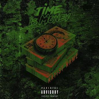
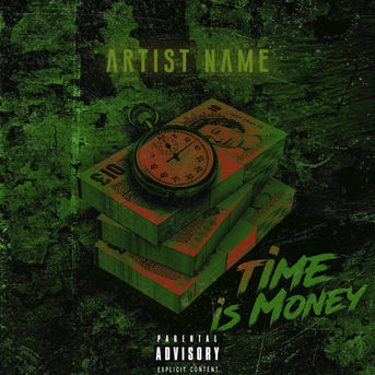
TiME is MONEY
Process...
I used Photoshop to make this cover. The originals are the red and blue covers above.
I wanted to make an updated version of this as I wasn't fully satisfied with how it came out.

I used the complementary colours, red and green to create contrast. I also used the red to create a sense of urgency related to the concept of time. The green was more to connect to money, in that American dollars are green. I did this to point to a more international theme despite using british cash money in order to make it more relevant to the majority of the target audience. I used a graffiti type handwritten font in combination with the angle to symbolise speed.
I used a brick wall background as this related most to the typefaces I have used as well as the grunge aesthetic prevalent in the cover.


I used Photoshop to make this cover.
The original is the red and blue covers above, but I wanted to make an updated version of this as I wasn't fully satisfied with how it came out.
I wanted to use red in the centre as highlight to draw attention to the 'time' and the 'money' objects in the composition. The red also serves to bring a sense of urgency, which again draws attention to it and the phrase 'time is money'.
My colour scheme is largely made out of complementary colours, namely red and green. As they are also contrasting, this cover might appeal to Generation Zs and Millennials as they are both said to prefer high contrast.


I was quite happy with this album cover trial.
This is the first album cover that I made by myself without completing a tutorial. I started using one, but then I carried on by myself just experimenting with different ideas that I had.
With this cover, I mostly focused on ‘masking layers’ to create a composite from which I used different tools and options to get my desired effects. For my final poster, as It will be a composite, I wanted to focus on masking layers and try to master that as best as I can.
With this cover, I made sure to work on the processes and techniques that I most struggled with in Photoshop, like the blending options (that I learnt more about with the cover at the top). How to use the curve and hue & saturation tools properly, masking layers correctly, and just generally how to combine different elements and different objects together to make a scene that looks professional or natural.
If I had more time with this, I would work on the text more to make it more professional looking.
All of the photos I used in this album cover are from 'pexels.com', 'unsplash.com' and google images for her necklace. I used an existing pattern in Photoshop for the pattern on her jacket
I followed a tutorial to make this. But I changed the image that they used. I got the girl from ‘unsplash’ and edited her myself, following what they did as a guideline.
This tutorial mostly focused on using the brush tool to brighten or darken or change the colour of an area, that is how the highlight on the shoulder is made. It also showed how to arrange the text in a professional manner.
I also learnt more about tracking (overall spacing between groups of letters), leading (vertical spacing between lines of type and kerning (the adjustment between individual letters). I posted this on my Instagram and received a lot of positivity from it.
People said that it looked professional and it got the most amount of likes at the time.


